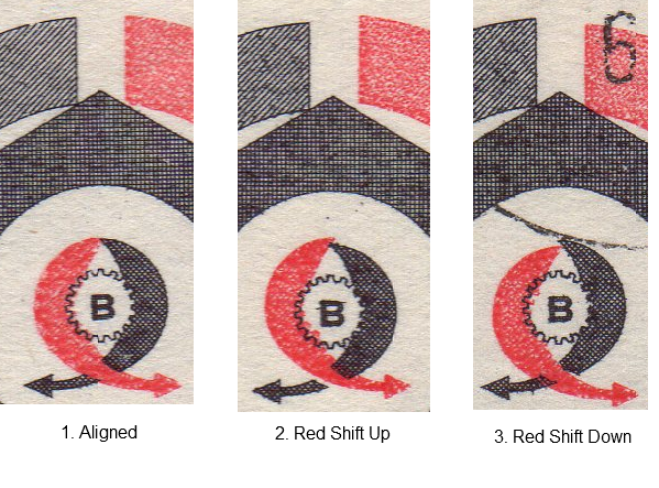
For stamps printed in multiple colors (2 in this case), one of the things I always am on the lookout for is color shifts. These color shifts are usually pretty easy to spot, and, are usually pretty common if you have enough duplicates to look through.
This is example is 1966, Scott #1414 issued to commemorate the 8th International Trade Fair in Brno (now in the Czech Republic)
Below is a closer look at the shift. Node the red shifted either up or down.
I didn’t see any examples where the colors shifted too much to the left or right.

